
Shadcn Components Are Yours
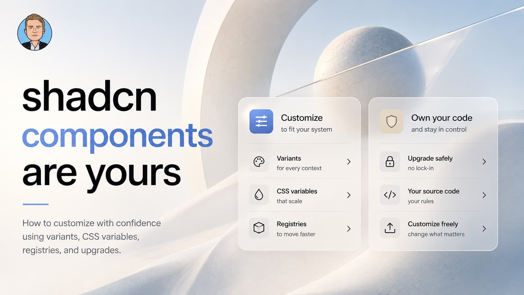
Customizing shadcn feels risky if you treat it like a library. It is not a library. Here is how I ended up thinking about variants, CSS variables, registries, and upgrades without fear.
I have been building a Next.js project with shadcn for a while, and the same situation keeps coming up.
A designer hands me a new ghost button design. Before I touch components/ui/button.tsx, I already know where this goes. The ghost variant is also used inside Calendar day cells, Dropdown items, and Command items. If I edit the variant, all three change with it. The designer was not thinking about the day picker.
The safest move is to leave the components alone and only edit CSS variables. Color, radius, ring, foreground, background. Most of "make it look like our brand" lives in those tokens.
But sometimes the variables are not enough. The business wants a brand identity that asks for structural choices CSS variables cannot express. At some point you have to customize the base components.
Here is the plan I ended up with that lets you do that without breaking anything.
The mental model is the whole problem
What makes customization feel risky is one wrong belief. That shadcn components are a library you are forking.
They are not.
Shadcn is not a package manager. The CLI is a code generator. When you run npx shadcn add button, that file is dropped into your project. From that moment on, it is your source code. There is no upstream tracking. There is no npm update. The question becomes: how do I edit my own code without breaking anything?
The answer is much less scary.
CSS variables for the system
CSS variables are the first step, and the safer one. The token layer of the design system lives there. Color, radius, foreground, background, ring, accent, muted. These are global decisions, and changing them ripples through every component at once.
That ripple is the point. It is also why the same coupling logic that applies to variants applies here. Colors are reused across components. Change the accent and the dropdown highlight changes too, along with the focus ring and the calendar selection. Pick those values carefully.
Use a tool. The official shadcn theme builder and tweakcn both give you a GUI to design a palette, preview it across the whole component set, and ship a globals.css patch you install via the registry. Consume the theme, forget the registry exists.
Variants for context-specific designs
A designer asks for a "new ghost button." My old practice was to update the ghost variant in button.tsx, then smoke-test every place the variant was used: Calendar, Dropdown, Command. Most of the time, at least one looked off. So I would patch those components too, restyling them to fit the new ghost.
That cascade is the wrong shape of work. "New ghost button" usually means "in this surface I am designing, the ghost button looks like this." The designer was thinking about the marketing CTA open in their Figma. They were not thinking about the day picker.
That is not a change to ghost. That is a new variant. Call it brandGhost, or cta, or whatever your system names it.
The rule:
- Existing variants stay untouched, because they are wired into compound components like Calendar, Dropdown, Command, Pagination.
- New variants get added for new contexts.
- You still have one Button. You just have more variants on it.
Adding a new variant is safer than editing the default. Editing the default ripples to every compound component using it, and you end up restyling things you never meant to touch.
Do not go the other way and create a parallel AppButton. Devs will pick the wrong one. Compound components shadcn ships will not use it. Your design system becomes two Buttons and vibes.
When to make a new component
Sometimes a "fancy button" is not a variant. It is structurally different.
The litmus test is one question. Can the fancy thing be expressed as a className passed through buttonVariants()?
If yes, it is a variant. Add it to the existing file.
If no, it is a new component. Make a new file in components/ui/. Examples that fail the test: a shimmer effect needing an overlay div, magnetic hover needing framer-motion wrappers, a loading button with internal idle and loading states, a multi-slot button with icon areas the regular Button cannot produce.
The naming rule for these new files: name by what makes them structurally different, not by where you will use them.
ShimmerButton good. CtaButton bad, because CTA is a usage context.
MagneticButton good. HeroButton bad, for the same reason.
The bar to create a new file is "I literally cannot express this with className." Anything below that bar is a variant.
Blocks for composing marketing pages
A marketing site ends up with reusable blocks. Hero, FeatureGrid, Pricing, Testimonials, CTA, FAQ, Logos. You compose pages from them. Same block, different page, different props.
These are composed components, not primitives. They wrap primitives with layout, spacing, and content slots. They do not belong in components/ui/.
Put them in components/blocks/. One file per block. Name by shape, not by page.
HeroSplit, HeroCentered, PricingThreeTier, FeatureGridFour, TestimonialCarousel, CtaBanner. Names like HomeHero or AboutCta are wrong because they couple the block to a page it might outlive. The home page can switch heroes. The block does not need to know.
A page becomes a thin file that composes blocks:
import { HeroSplit } from "@/components/blocks/hero-split";
import { FeatureGridFour } from "@/components/blocks/feature-grid-four";
import { PricingThreeTier } from "@/components/blocks/pricing-three-tier";
import { CtaBanner } from "@/components/blocks/cta-banner";

export default function HomePage() {
  return (
    <>
      <HeroSplit title="..." subtitle="..." />
      <FeatureGridFour features={[...]} />
      <PricingThreeTier plans={[...]} />
      <CtaBanner heading="..." />
    </>
  );
}
Blocks installed from third-party registries (shadcn blocks, Aceternity, Magic UI) land in the same folder. Once installed, they are your code. Rename them by shape if the upstream name is page-coupled.
Components by role, not by source
The trap I often see in projects. Organizing components by where they came from.
components/registry/ for third-party stuff. components/ui/ for shadcn primitives. components/app/ for my own work.
That structure organizes by origin, and origin is temporary. The moment I install a fancy button from a third-party registry, that file is mine.
A better structure organizes by role:
components/ui/for leaf primitives. Regardless of whether shadcn, Aceternity, Origin UI, or I shipped them.components/blocks/for reusable page sections (Hero, Pricing, FeatureGrid, CTA).components/top level for app-specific composed components that wrap primitives with app behavior (ConfirmDialog,PageHeader,SubmitButton).components/<feature>/for feature-scoped components (components/posts/,components/billing/).
If you want to remember where a primitive came from for future audit, leave one comment at the top:
// source: aceternity-ui / shimmer-button / 2026-05That is enough.
What the registry is actually for
The shadcn registry is a copy-on-install distribution layer. It is not a versioned dependency system.
For consuming, it is useful in two cases.
One, theme registries. Tools like tweakcn generate a CSS variable palette and install it as a globals.css patch.
Two, component libraries built on shadcn (Aceternity, Magic UI, Kibo UI, Origin UI). They ship blocks (animated heroes, pricing tables, command menu variants) you install via npx shadcn add <url>. The source lands in your project. You own it from then on.
For publishing your own, the question is whether you have a second project that would consume it. If yes, build a registry. If no, do not. With one project, you are building distribution infrastructure for a problem you do not have.
The upgrade workflow is small and rare
Do not be afraid to update the shadcn components.
There is no npm update. The components are stable. Most teams running shadcn for a year never re-pull a single primitive.
When you do want to take an upstream change, the workflow is:
- Watch the
shadcn-ui/uirepo for releases. Do not poll, subscribe. - The trigger is a specific need. An accessibility fix you want, a Radix major bump, a structural rewrite.
- Open upstream's current file on GitHub. Open yours. Do a three-way diff in your head, including the version you started from.
- Port the upstream delta into yours. Your additions (new variants) are additive, so they do not collide with their changes.
- Update one comment at the top of the file:
// shadcn upstream: 2026-04-12 (a3f9c21)That is the whole thing. Manual, rare, on your terms. Maybe fifteen minutes per component, maybe once a year.
The real upgrade burden lives in the underlying packages, Radix and react-day-picker. Pin those in package.json and audit them with normal npm outdated review. That is where real breakage hides, not in shadcn's wrapper code.
The rules I ended up with
- Treat
components/ui/as your owned source code. Not a fork. - Set system tokens in CSS variables. Color, radius, ring, spacing.
- You can update the default variants, but adding new ones is usually safer. The defaults are wired into compound components like Calendar, Dropdown, and Command, so any change ripples.
- Never create a parallel
AppButton. One Button, many variants. - New file only when the design needs JSX structure className cannot produce. Name by what makes it structurally different.
- App-level composed components live at the top of
components/or in feature folders. They wrap primitives with app behavior. - Organize by role, not by source. Leave a one-line comment if you need to remember origin.
- Consume registries for themes and fancy blocks. Do not publish unless you have a second project.
- Pin Radix and
react-day-pickerexplicitly. That is where real upgrade work lives. - Reconcile with upstream only when a specific change is worth porting. Manual, rare, on your terms.
The version of this article I almost wrote was "do not touch shadcn components."
That version was wrong. The components are yours. Treat them that way.
Liked this? Get the next one in your inbox.
One email every other Tuesday. Engineering, product, and what I'm shipping. Unsubscribe anytime.